
Hostroo is a platform that helps people compare web hosting providers and pick the right one — real ratings, real pricing, and enough depth for beginners and experts alike. I joined as lead product designer and became one of three co-founders, owning product strategy, feature scoping, and the trade-offs that came with building for both audiences at once.

A Web Hosting Comparison Platform
Hostroo: Turning Hosting Chaos Into a Map
My Role
- Lead Designer → Co-Founder
- De facto Product Manager
Team
- 3-person founding team
- Engineering, Sales & Ops, Product/Design
Platform
- Web (Desktop)
- Mobile discontinued
Timeline
- ~18 months
- 3-month v1, then ongoing
Project Type
- Hosting comparison platform
- Full redesign & re-founding
Domain
- Web Hosting / Infrastructure
- Iran Market
Key Impacts
- Owned product strategy + design
- Measurable growth from the redesign
Tools
- Figma, Attlassian Suite
- GA4, Clarity
What I Did
- Joined as lead product designer, became a co-founder, and owned product strategy — from sourcing and scoping features to shipping them.
- Designed and tested a layered information architecture that served beginners and experts from the same interface.
- Made hard trade-off calls: cut mobile development, held the line on honest provider data, chose delight over speed more than once.
- Ran continuous research — interviews, dogfooding, focus groups — that directly shaped the next product, Hostplore.
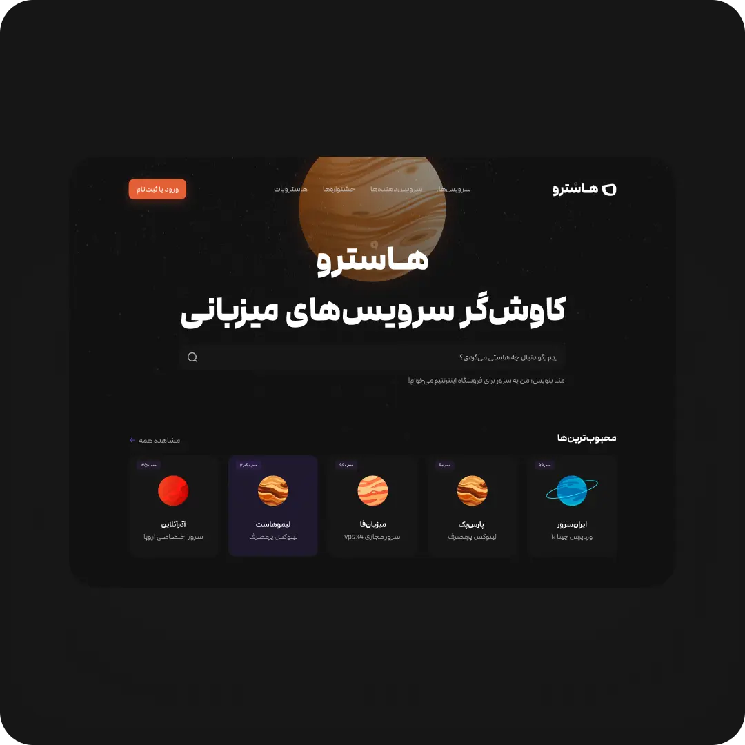
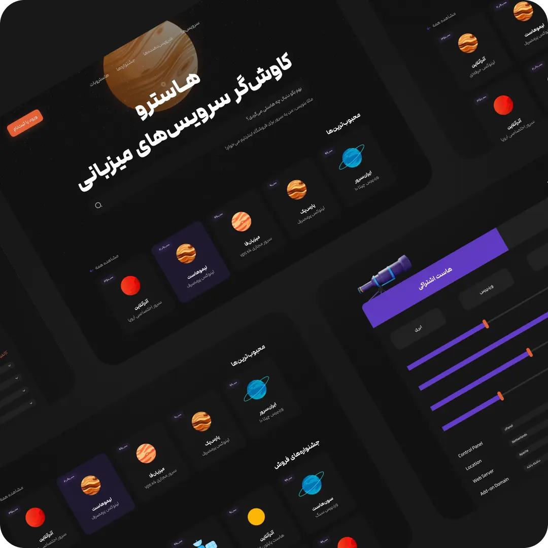
- Gave the product a distinctive identity, using a galaxy-based comparison system to make complex choices easier to remember.
What changed
- User base grew 300% after the redesign, with 40% of users returning for their next hosting decision.
- Time to pick a suitable host dropped by roughly half.
- Listed providers saw a 25% lift in conversions — the honesty bet paid off for them too.
- User approval held at 90%, even while publishing data providers didn’t always want shown.
Why it matters
Most hosting decisions are made on trust, not specs. Hostroo earned that trust by refusing to hide the data that made providers look bad — and by making hard calls, like cutting mobile, instead of shipping something diluted.
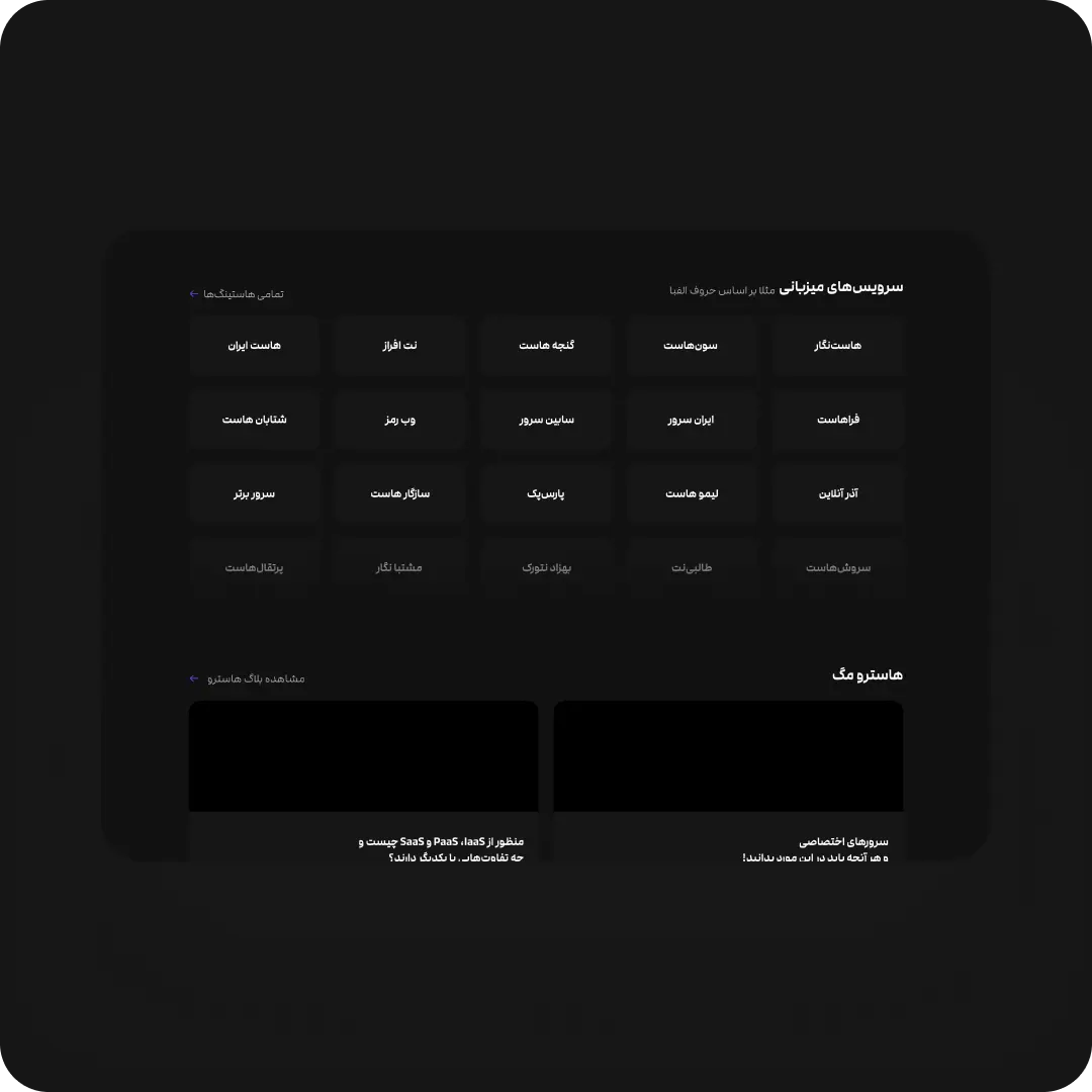
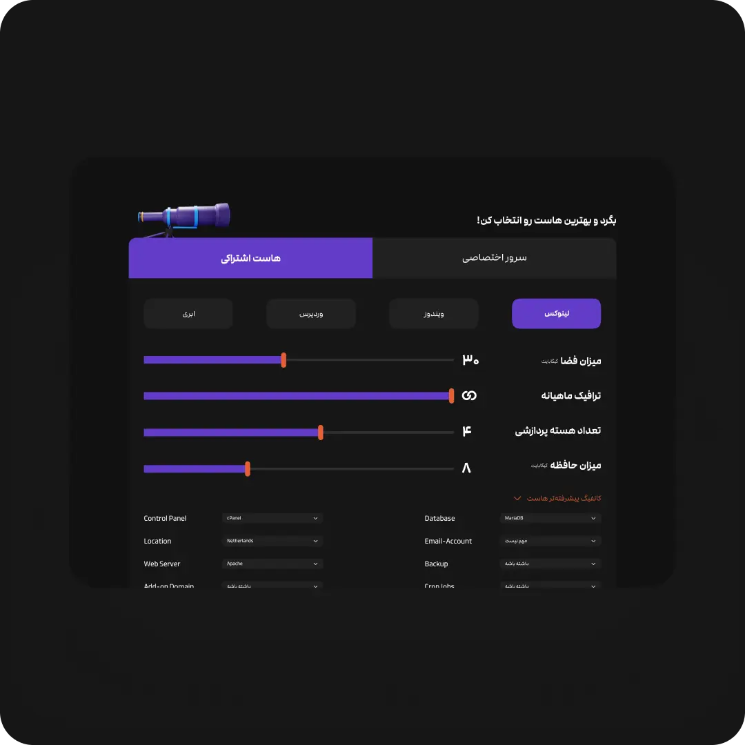
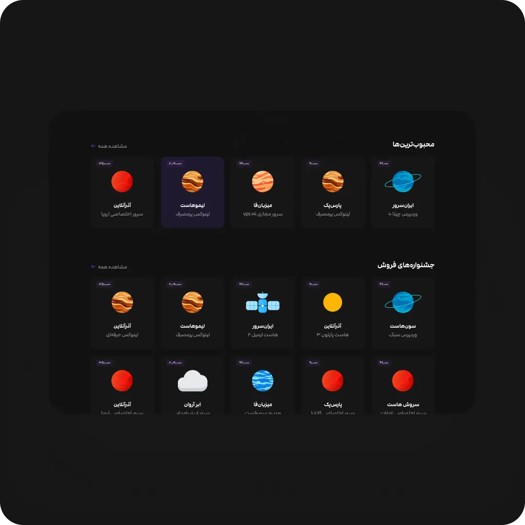
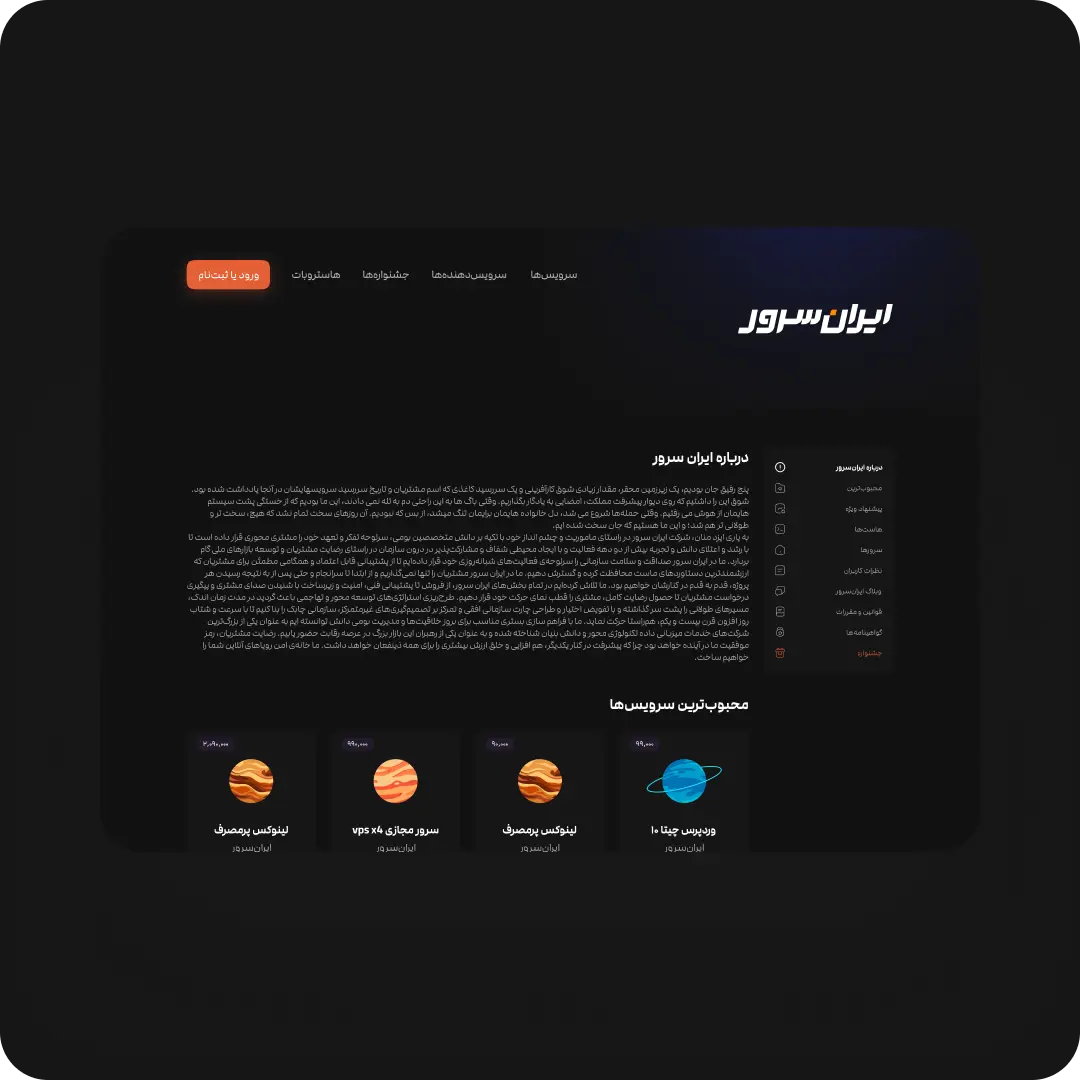
End of TL;DR⊛
End of TL;DR⊛
End of TL;DR⊛
End of TL;DR⊛
End of TL;DR⊛
End of TL;DR⊛
End of TL;DR⊛
End of TL;DR⊛
The short version glosses over the parts that actually shaped the product: what users had to do before Hostroo existed, the trade-offs I made under real constraints, and the one research finding that changed the next product entirely.
Before / After
The User Journey
Before Hostroo
- Dozens of browser tabs open across different provider websites
- No shared frame of reference to compare specs, pricing, or reliability
- Trust signals limited to whatever marketing copy each provider wrote about itself
- Decisions made on gut feeling or brand recognition, not data
With Hostroo
- One destination, multiple flows to the same end point: a chosen service from a trusted provider
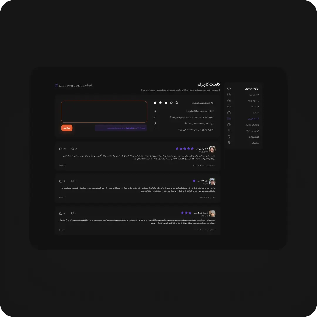
- Every provider shown with real satisfaction scores and user ratings, not just self-reported claims
- Full specs and pricing available per service, at whatever depth the user needed
- A principled choice — guided by need-based questions, not just the lowest price
The Core Product Flow
Users reached a final decision through several possible paths, but the flow always ran through these four stages.
Step 1
Search
Plain-language search — type what you need, not what you know to look for.
Step 2
Compare Providers
Real satisfaction ratings and user reviews for every provider, side by side.
Step 3
Compare Services
Full specs and pricing per plan, configurable down to raw resource sliders.
Step 4
Decide With Trust
A principled choice, backed by real reviews rather than the loudest marketing claim.
Research
The Layering Insight
Method
Interviews, dogfooding sessions, and focus groups run continuously through the layered-UX rollout, not as a one-time research phase.
Finding
The layered architecture worked for simplifying one service’s specs. But stacking service-level detail on top of provider-level detail added a whole extra layer of decisions users didn’t actually need.
What I Did With It
That finding didn’t get acted on at Hostroo itself — it directly shaped the next product, Hostplore, where I cut a full layer of abstraction and focused the whole flow on choosing the right provider.
What Was Broken?
01
Decision Paralysis
Choosing a web host wasn’t a beginner-only problem. Even technically confident users second-guessed themselves comparing specs, prices, and provider claims with no shared frame of reference.
02
Closed Data
Hosting providers rarely published honest performance data. Some Iranian providers actively resisted having their weaknesses shown next to competitors.
03
Split Interface
Existing comparison sites picked a side: dumbed-down for beginners, or dense spec sheets for engineers. Nothing served both from the same screen.
The Goal
Make Every Skill Level Confident
Build a platform where a first-time site owner and a senior sysadmin can both land on the right host — without either one feeling patronized or overwhelmed.
Multi-Literacy UX
Radical Transparency
From Confusion To Confidence|
From Confusion To Confidence|
From Confusion To Confidence|
From Confusion To Confidence|
The Calls I Made
Product Decisions
Three calls that had no clean answer — each one traded something real away to protect what mattered more.
01
Why We Killed Mobile
A meaningful share of traffic was mobile. We cut it anyway — a diluted version of the core comparison experience would have hurt trust more than having no mobile app at all.
● Killed
02
Transparency Over Provider Relationships
Providers wanted softer numbers. We kept the real ones. It cost goodwill with some partners — it’s the only reason users trusted the comparisons at all.
● Held Firm
03
Guided Comparison Over Endless Filtering
Filters give power, not answers. We built toward a decision — need-based questions and layered detail — instead of a filter panel that let users configure their way into paralysis.
● Chose
My Strategic Framework
Three bets shaped every decision that followed, from how the product was built to how far I was willing to push it against speed.
Waypoint One
Layered By Design
Layer the interface so beginners see simplified signals by default, while power users can drill into raw specs without ever leaving the page.
Waypoint Two
Radical Honesty
Publish real reliability and pricing data even when providers pushed back — trust with users mattered more than comfort for providers.
Waypoint Three
Delight Over Speed
Push for a product that felt genuinely crafted, not just functional — a bet I’d reconsider today. More on that below.
Decisions, Failures, and Surprises
How It Played Out
Some of these bets paid off immediately. Others took a failed prototype, an abandoned mobile app, and an uncomfortable conversation with providers to get right.
Building the Galaxy
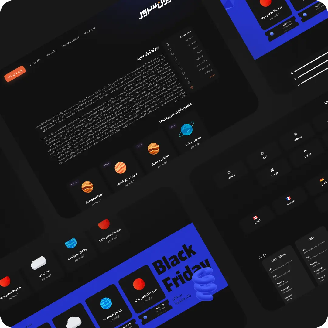
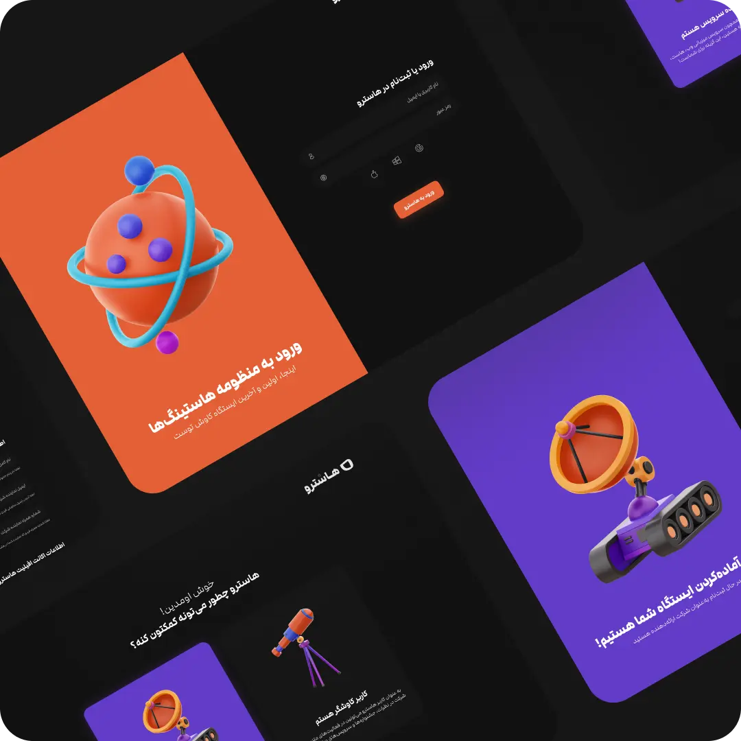
The name Hostroo blended “Astro” and “Host” — providers became galaxies, services became planets, and a consistent voice carried the metaphor through onboarding, comparisons, and error states.
What I Built
A recognizable visual and verbal system meant to make comparisons easier to scan and remember, not just decorate the interface.
What I Fixed
Early tests showed users couldn’t connect a planet’s look to what it offered. I mapped planet colors to categories users already recognized — WordPress blue for WordPress hosting — turning decoration into a real shortcut.
The Mobile Wall
A meaningful share of traffic came from mobile, so a responsive version wasn’t optional — until it turned out to be the one problem we couldn’t crack.
What Failed
Every mobile version either hid too much detail to be useful or crammed in so much it stopped being scannable — the core value of the design didn’t survive the smaller screen.
What I Decided
Rather than ship a worse experience, we intentionally stopped mobile development, stayed desktop-only, and left it as a problem to revisit later.
Naming Names
Real reviews only work if providers can’t quietly edit the data that makes them look bad — and that made Hostroo unpopular with some of the companies it reviewed.
What Providers Wanted
Several Iranian hosting providers pushed back, uncomfortable with negative data being public, and wanted the ability to soften their own reviews.
What We Held Firm On
We kept the data honest anyway — being straight with users about real performance was the entire reason Hostroo existed.
The Trade-Offs
Decisions That Had No Clean Answer
- Mobile vs. desktop: cut mobile entirely rather than ship a diluted version of the core experience.
- Honesty vs. provider relationships: kept real, unflattering data public even as providers pushed to soften it.
- Delight vs. speed: chose craft and polish over faster shipping — a call I’d revisit today, more below.
What I'd Do Differently
I was all-in on this project — product, design, brand, tone, positioning. My instinct was to make Hostroo genuinely delightful, not just functional, and that meant I leaned hard into detail and craft, sometimes past the point it was earning its cost. Looking back, that perfectionism is the one thing I’d pull back on: ship the working version sooner, polish after it’s validated, not before. The screens in this case study still aren’t as close to what I’d consider an ideal execution as I’d like — they’re the product of a small team moving fast under real constraints, not a finished vision.
Navigating Real-World Constraints
This was a three-person team: one engineer, one person running sales and operations, and me covering product, design, and — eventually — most of the brand and content work too. AI design tooling didn’t exist yet, so every layout, icon, phrase, and metaphor test was built and validated by hand — part of why hard trade-offs, like cutting mobile, had to happen early rather than getting deferred.
18 Months, Three Founders
From Strategy to Rollout
The project moved from a rough legacy version, through a full redesign, and eventually wound down for reasons outside the product itself.
Before Hostroo
Crash Landing
Hostroo already existed, but with a rough, confusing design nobody fully trusted or wanted to use — the reason the redesign began.
Month 1–3
First Launch
Rebuilt the core experience around the layered comparison model. Even these first screens started moving the numbers before the platform fully shipped.
Month 4–9
New Orbit
Became one of three co-founders — sourcing and shaping features while owning the product’s full trajectory.
Month 10–15
Deep Space
Built the layered information architecture, committed to honest provider data, and pushed the mobile experiment that ultimately failed.
Month 16–18
Re-Entry
Paused as personal circumstances hit all three co-founders at once. The lessons carried directly into the next product, Hostplore.
Measured Impact
Results
Once the redesign shipped, the numbers moved fast. Hostroo’s user base grew 300% while recurring users climbed 40% — and even the earliest redesigned screens were already cutting decision time and lifting provider conversions before the full platform had rolled out.
Tracked through Google Analytics and Microsoft Clarity across the platform’s most active period.
Primary Outcome
300
%
User Growth
Hostroo’s user base tripled after the redesign shipped, driven largely by word-of-mouth from users who finally trusted the comparisons they were seeing.
Tracked via Google Analytics
Recurring Users
40
%
returned for their next decision
More users came back to Hostroo the next time they needed a host, instead of starting their search from scratch.
Decision Speed
50
%
less time to pick a host
The layered interface cut the average time users spent comparing providers roughly in half.
Provider Conversions
25
%
more sign-ups per provider
Providers listed on Hostroo saw a real lift in conversions — proof the redesign moved business outcomes, not just aesthetics.
User Approval
90
%
user satisfaction
Nine in ten users rated their experience positively, even with the platform being fully honest about weaker-performing providers.
Behavioral Shift
Hostroo Became a Standard, Not Just a Tool
Smaller providers gained real visibility for the first time, and Hostroo’s transparent scoring pushed the wider market toward publishing more honest data.

Client Feedback
“Soroush is an exceptional friend and an outstanding professional in his field. His creativity knows no bounds, and he has an excellent understanding of customer insights paired with a sharp product vision. In my experience working with several businesses, I’ve never encountered someone with the quality Soroush brings. Whenever he joins a project, he becomes so deeply immersed it feels like a part of him, dedicating himself fully without expecting anything in return. Any business that collaborates with Soroush is sure to thrive.”
Mehran Talebi — CEO & Founder, Hostroo

