
I led product strategy and UX for the complete redesign of Eco, a recycling platform used by 350K+ people. The product solved a real need but felt cold, confusing, and transactional. My job was to turn it into a trusted daily habit.

Iran’s #1 recycling platform, trusted by over 350,000 users across 6 cities.
Trust, Speed, and Habit in Eco’s Recycling Experience
My Role
- Staff Product Designer (IC)
- De Facto Product Manager
Team
- Cross-Functional Teams
- CEO, CTO, Engineering & Ops
Platform
- Android & PWA
- 350K+ users
Timeline
- ~12 months (Full-Time)
- strategy → rollout
Project Type
- Full UI/UX Redesign
- Product Strategy
Domain
- Waste Management
- Sustainability
Key Impacts
- Reduce Friction & Support Calls
- Significant MAU Growth
Tools
- Figma (WF-P-Design)
- Clarity, AppMetrica
What I Did
- Simplified the core pickup request flow, radically reducing friction and cognitive load.
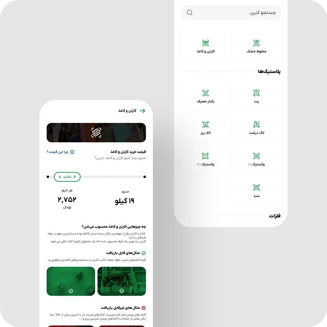
- Made recyclable pricing interactive and educational, eliminating the #1 source of support calls.
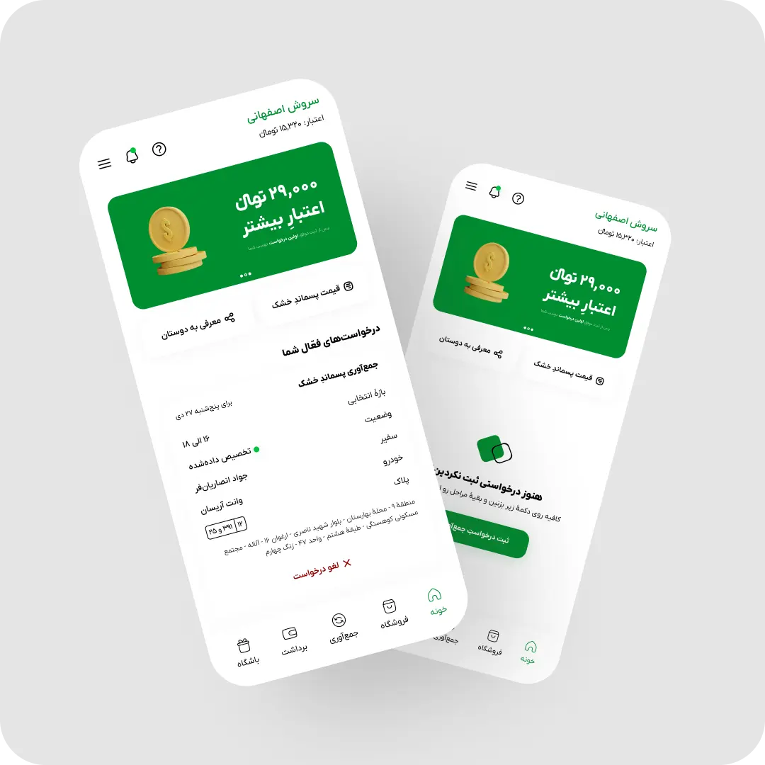
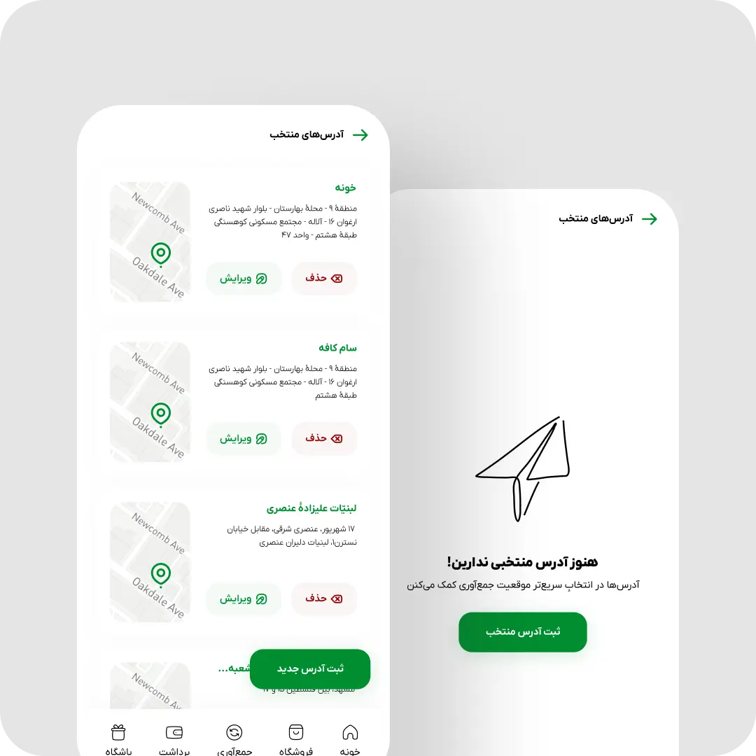
- Reduced repeat requests to a single tap by intelligently saving and pre-filling user addresses.
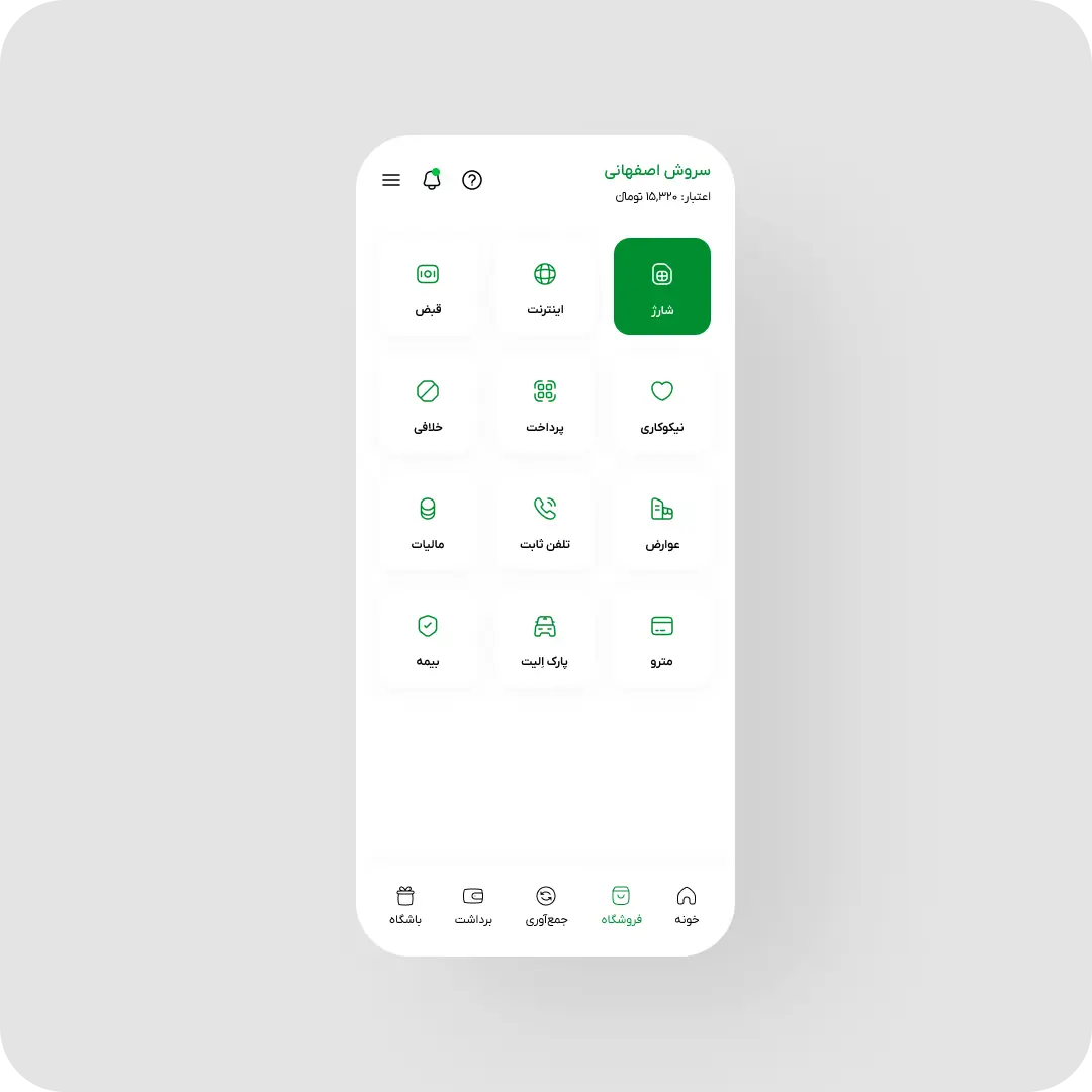
- Redesigned the marketplace around everyday usage, making it easier to spend rewards than to cash out.
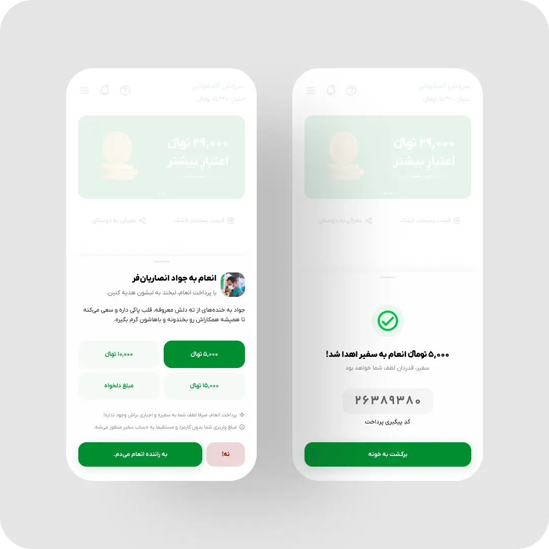
- Designed subtle sound feedback for key actions, giving users instant, peripheral reassurance.
What changed
- 45% faster request completion
- 35% fewer product-related support calls
- 23% increase in monthly active users
- 25% more wallet balance retained in-app
- 15% more repeat collection requests
Why it matters
This wasn’t a feature drop. It was a system-level trust rebuild—where every interaction, from a simplified flow to a confirmation sound, reminded users that the product respected their time and effort.

End of TL;DR⊛
End of TL;DR⊛
End of TL;DR⊛
End of TL;DR⊛
End of TL;DR⊛
End of TL;DR⊛
End of TL;DR⊛
End of TL;DR⊛
From here on, we’re officially in territory for people who actually read the whole thing. If you stop right here, you’ve basically got the full picture — what was broken, what we did, how it turned out. But if you want to know exactly why the first pricing slider flopped, or how sound ended up killing a chunk of support tickets, this is where the real story starts — with the details, the wrong turns, and the stuff that surprised us.
What Was Broken?
01
Friction-Heavy Flow
The pickup flow buried users in unnecessary steps and unclear fields, with no smart defaults to speed things along — a friction point that drove frequent abandonment.
02
Invisible Pricing
Users had no way to see what their recyclables were worth before the driver arrived, which pushed repetitive support calls and steadily eroded trust in the service.
03
Leaky Reward Loop
Most users cashed out their rewards immediately instead of spending them in-app, which kept Eco from ever becoming a sticky, self-reinforcing financial habit.
The Goal
Make Recycling Feel Effortless and Rewarding—Every Single Time
I set a clear north star: make completing a collection request so fast and so reassuring that people wouldn't think twice about coming back. We needed to halve the time it took to finish a request, absolutely crush the confusion around pricing, and build a rhythm of positive reinforcement that turned casual users into loyal recyclers.
Kill Friction
Radical Transparency
UX overhaul of Iran’s top waste app|
UX overhaul of Iran’s top waste app|
UX overhaul of Iran’s top waste app|
UX overhaul of Iran’s top waste app|
The Calls I Made
Product Decisions
None of these had a clean, cost-free answer — each one traded something away on purpose.
01
Made Pricing Interactive, Not Just Visible
Instead of a static price table, users get a slider that shows what their waste is worth as they adjust weight and material. It cost more design and engineering time than a flat table would have.
● Kept — became the biggest trust driver
02
Auto-Filled Addresses Over Rebuilding Onboarding
Rather than redesigning the entire request form, I targeted the single biggest drop-off point — re-entering an address — and left the rest of the flow largely untouched.
● Chose — surgical fix over full rebuild
03
Killed the Full Loyalty-Points System
A points program could have driven more engagement, but it added complexity to a utility-first product. I shipped lightweight, contextual rewards instead.
● Killed — deliberately scoped down
My Strategic Framework
I didn’t start with screens. I started with three core bets that gave the entire team a clear decision-making filter. Several popular ideas were intentionally shelved to protect focus—a hard but necessary call I defended repeatedly in leadership meetings.
Bet One
Tangible value builds trust
Instead of a buried price table, I made pricing interactive and educational—so users knew exactly what their waste was worth and why.
Bet Two
Effortless repetition builds habit
I reduced the most frequent task—scheduling from the same address—to a single tap, removing the biggest source of daily friction.
Bet Three
Easier spending builds retention
I redesigned the marketplace around one-handed ergonomics, gently shifting where users chose to keep their money.
Research
What the Data Actually Showed
Method
Support-ticket analysis, session replays, and short user interviews focused on the pickup and pricing flow.
Finding
The confusion wasn’t only about pricing being hidden — many users genuinely didn’t know how to categorize their own recyclables.
What I Did With It
I paired the pricing slider with simple, plain-language descriptions of each material — turning the feature from a price check into a small classification tool.
Decisions, Failures, and Surprises
How It Played Out
This is where strategy turned into product decisions. Some ideas worked exactly as expected. Some failed in testing. And a few small details changed user behavior more than we predicted.
Making Pricing a Trust-Building Tool
Support tickets showed a clear pattern: users couldn’t easily understand what their recyclables were worth, and many weren’t sure how to categorize their own waste. The pricing data existed, but it was hidden from the user experience.
Hypothesis
If pricing became visible, interactive, and easy to understand before pickup, users would feel more confident and ask fewer support questions.
What I built
I added a clear “View Prices” entry point from the home screen. Users could choose a material—cardboard, PET plastic, HDPE—and use a slider to see how their reward changed based on weight. I also added simple descriptions for each material type, so users could understand what belonged where.
Surprise
The slider helped, but the educational copy changed behavior more than expected. Many users didn’t know how to classify their recyclables. Once that became clear, a major psychological barrier disappeared.
What failed
My first idea was to keep a dynamic price card always visible on the home screen. In testing, it created noise and users ignored it. I replaced it with a simple entry point, which made the pricing experience feel intentional instead of distracting.
Reducing Repeat Friction to a Single Tap
Session replays showed returning users repeatedly entering the same pickup address. The drop-off at this step was too obvious to ignore.
Hypothesis
If Eco remembered the last used address, repeat pickup requests would become significantly faster.
Baseline context
Before the change, the median repeat request time was around 45 seconds. After launch, users who used the saved-address flow—roughly 80% of returning users—completed the same task in about 14 seconds. That was a ~70% reduction for that segment.
What I built
I introduced a “Use last address” option that turned a multi-step form into a single confirmation tap for returning users.
What users rejected
A small but vocal group didn’t fully trust the pre-filled address. To reduce that anxiety, I added a subtle map preview next to the confirmation action. That extra visual confirmation increased adoption and made the shortcut feel safer.
Redesigning the Marketplace to Change Financial Behavior
Eco’s marketplace allowed users to spend recycling rewards on everyday services like mobile top-ups, bill payments, insurance, parking, and charity donations. But most users immediately withdrew their balance as cash. The “withdraw” action was winning.
Hypothesis
The problem wasn’t only motivation. Spending inside Eco was harder than cashing out. If we made in-app spending easier, more users would keep their balance inside the ecosystem.
Surprise
Ergonomics alone wasn’t enough. The behavior only started shifting when we paired the redesign with small contextual incentives, like a tiny bonus for paying a bill inside the app.
What I built
I redesigned the marketplace around one-handed mobile use. Primary actions became easier to reach, purchase flows were shortened, and the cash-out option was visually deprioritized without hiding it.
What I intentionally didn’t build
I decided not to introduce a full loyalty-points system. It could have increased engagement, but it felt too heavy for a utility-first product. I kept rewards lightweight, contextual, and tied to real user actions.
Designing Sound as a Confidence Layer
One of the less visible changes was sonic feedback. I believed sound could reduce the silent anxiety users feel after taking an important action.
I designed short audio cues for key moments: a warm confirmation for a scheduled pickup, a clear alert for a failed payment, and a gentle chime when money arrived in the wallet.
These sounds weren’t decorative. They gave users instant reassurance without forcing them to stare at the screen and wonder whether something had worked.
After launch, we saw fewer duplicate actions and fewer “did it go through?” support questions.
Improving the Small Moments Around the Core Flow
Beyond the big strategic bets, I worked on dozens of smaller touchpoints that shaped the overall feeling of the product.
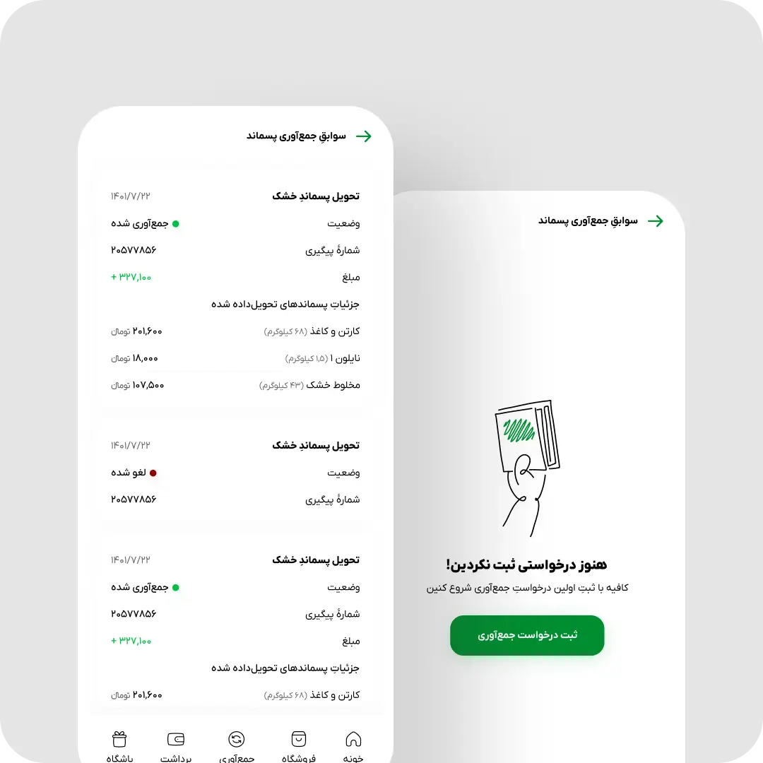
Error states became clearer. Empty states explained what to do next. Loading moments felt lighter. Microcopy became more human. I also added a lightweight exit survey when users left the request flow, giving the team a steady stream of qualitative feedback without interrupting the experience.
These details mattered because trust wasn’t built in one screen. It was built through every small moment where the product either respected the user—or created doubt.
Navigating Real-World Constraints
The redesign happened while the engineering team was also working on a major backend refactor to improve performance and unlock faster future development.
My role was to adapt the UX roadmap to that reality. I met regularly with the CEO and CTO to decide what could ship immediately, what had to wait, and where we needed to protect engineering focus.
Some features I believed in had to be postponed. Some ideas were simplified. But that discipline paid off. Once the refactor stabilized, our iteration speed improved, and the team could move faster without compromising the experience.
How a Pickup Request Actually Works Now
Four steps, most of them optional after the first visit.
Step 1
Pick a Material
User selects what they’re recycling from a short, visual list — cardboard, PET, HDPE, and so on.
Step 2
See the Price
The interactive slider shows the estimated payout as the user adjusts weight, before they commit to anything.
Step 3
Confirm the Address
Returning users tap “Use last address” with a map preview; new users enter it once, manually.
Step 4
Schedule & Get Confirmed
Request is scheduled and a short confirmation chime plays — no need to double-check the screen.
Before / After
The User Journey
Before
- Pricing was hidden until the driver arrived
- Address had to be typed in every single time
- No feedback on whether an action succeeded
- Rewards were almost always cashed out immediately
After
- Interactive slider shows price before commitment
- Saved address turns re-entry into a single tap
- Sound confirms every key action instantly
- More balance stays and gets spent inside the app
How The Twelve Months Broke Down
From Strategy to Rollout
The redesign didn’t happen in a vacuum — it ran alongside a major backend refactor, so sequencing which work shipped when mattered as much as the design decisions themselves.
Month 1–2
Discovery
Support-ticket analysis, session replays, and stakeholder interviews surfaced the three core problems.
Month 2–3
Strategy
The three core bets were set and socialized with the CEO and CTO to align the team on what to build first.
Month 3–7
Refactor Overlap
Engineering’s backend refactor ran in parallel; the UX roadmap was adapted around what could ship safely.
Month 4–9
Design & Build
Pricing, saved-address, marketplace, and sound flows were designed, tested, and iterated in stages.
Month 10–12
Rollout & Measurement
Phased rollout across the 350K+ base, with GA4, Clarity, and Hotjar tracking the pre/post-launch results above.
Measured Impact
Results
The redesign didn’t just make Eco look cleaner. It changed how people moved through the product: requests became faster, pricing became easier to trust, rewards became more useful, and repeat behavior became more natural.
All metrics below were tracked pre- and post-launch using GA4, Microsoft Clarity, and Hotjar across the full 350K+ user base, with each figure representing the percentage change between equivalent 30-day windows before and after rollout.
Primary Outcome
45
%
Faster Completion
Pickup requests became significantly faster after simplifying the core flow, reducing unnecessary decisions, and making the main action easier to repeat.
Less Friction
Trust Signal
35
%
Fewer Support Calls
Transparent pricing and clearer material descriptions reduced repeated questions around value and categorization.
Growth Signal
23
%
MAU Growth
Making the experience faster, clearer, and more rewarding helped more users return and stay active month over month.
Marketplace
25
%
More Balance Retained
The redesigned marketplace made in-app spending easier, helping more wallet balance stay inside the Eco ecosystem.
Habit Loop
15
%
More Repeat Requests
Saved addresses and faster confirmation helped recycling become a repeatable habit instead of a one-off task.
Repeat Behavior
80
%
Saved-Address Adoption
Most returning users adopted the saved-address flow, showing that the shortcut felt useful once trust signals were clear.
Behavioral Shift
The biggest result wasn’t a single metric.
It was the shift in user behavior. Eco became less transactional and more habitual: people completed requests with less effort, trusted the service more, kept more value inside the product, and came back more often.
This proved the central bet behind the redesign: when a product respects the user’s time, reduces uncertainty, and makes the reward feel useful, trust compounds into habit.
The Trade-Offs
What I Gave Up to Get There
- Engineering time on pricing over polish elsewhere: the interactive slider took longer to build than a static table, which meant less time was left for smaller cosmetic touchpoints that shipped later than planned.
- Deprioritized, not hidden, cash-out: we chose not to fully bury the withdraw option, even though it worked against the marketplace bet — hiding it outright felt manipulative rather than persuasive.
- Roadmap discipline over scope: several features I believed in were postponed to protect the engineering team’s bandwidth during the backend refactor, even when it meant shipping a narrower version of the vision on time.

Straight from the CEO
“Soroush consistently elevated the way we approached digital products. His strategic thinking, user-centered mindset, and attention to detail significantly strengthened our product direction.”
Meysam H, CEO

