
Eco Driver is the operator-facing app for Eco Waste Management Solutions — used daily by around 200 drivers across 6 cities to collect requests from 350,000+ Eco users. I led the end-to-end redesign of how drivers get assigned work, log their status, drop off loads, and get paid.

One App, Many Drivers, No Room for Guesswork
Eco Driver: Redesigning a Field App for High-Stakes Logistics
My Role
- Staff Product Designer
- De Facto Product Manager
Team
- Cross-Functional Team
- Eng, Fleet Ops, Marketing
Platform
- Driver-Facing Mobile App
- Used Mainly Outdoors
Timeline
- Multi-Phase Redesign
- 3 Months, Full-Time (2023)
Project Type
- Native App Redesign
- Operations & Fleet Tooling
Domain
- Waste Management Logistics
- Driver Operations
Key Impacts
- +40% Driver Retention
- -20% Average Route Time
Tools
- Figma, Atlassian Suite
- Yandex AppMetrica, Clarity
What I Did
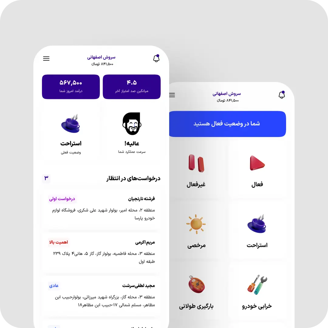
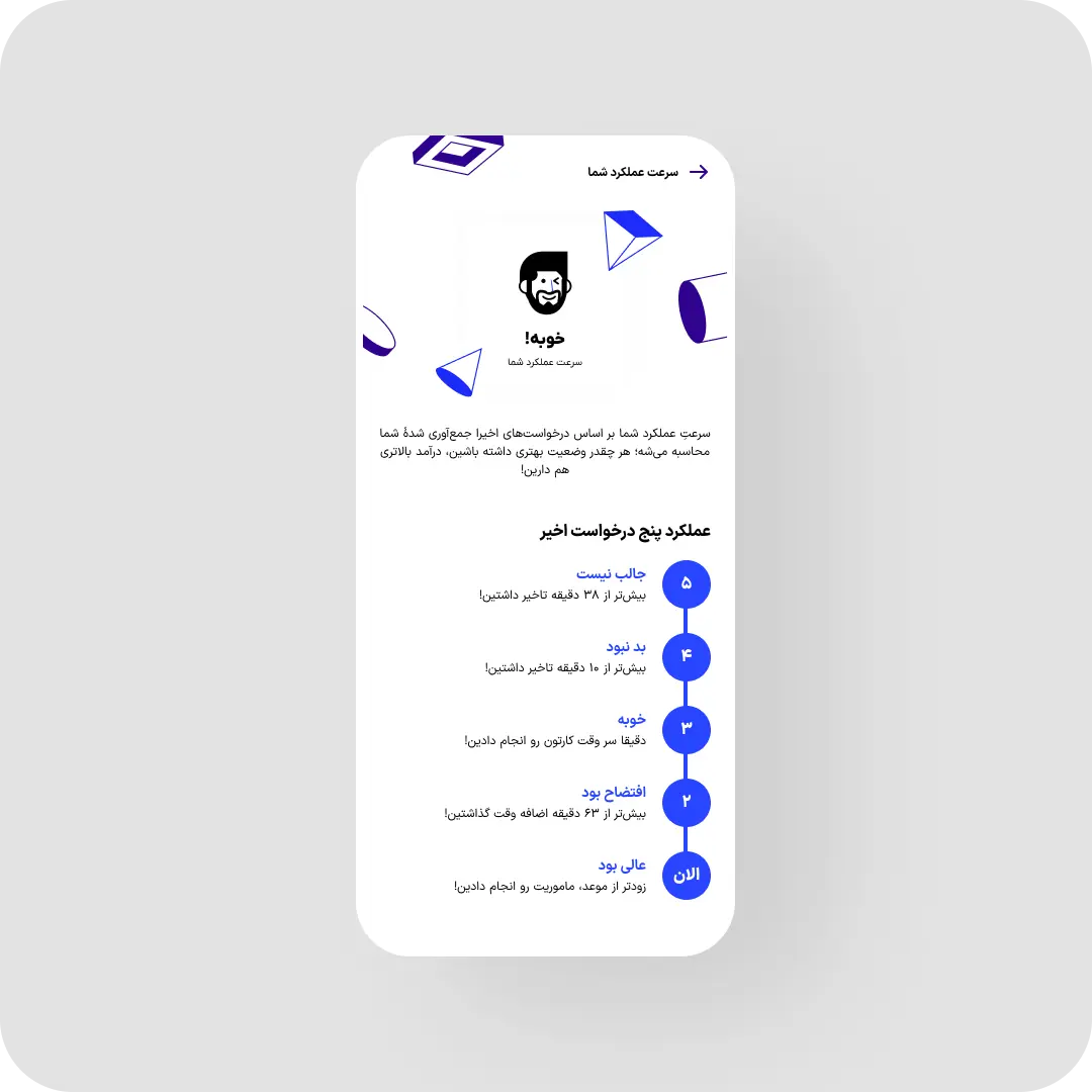
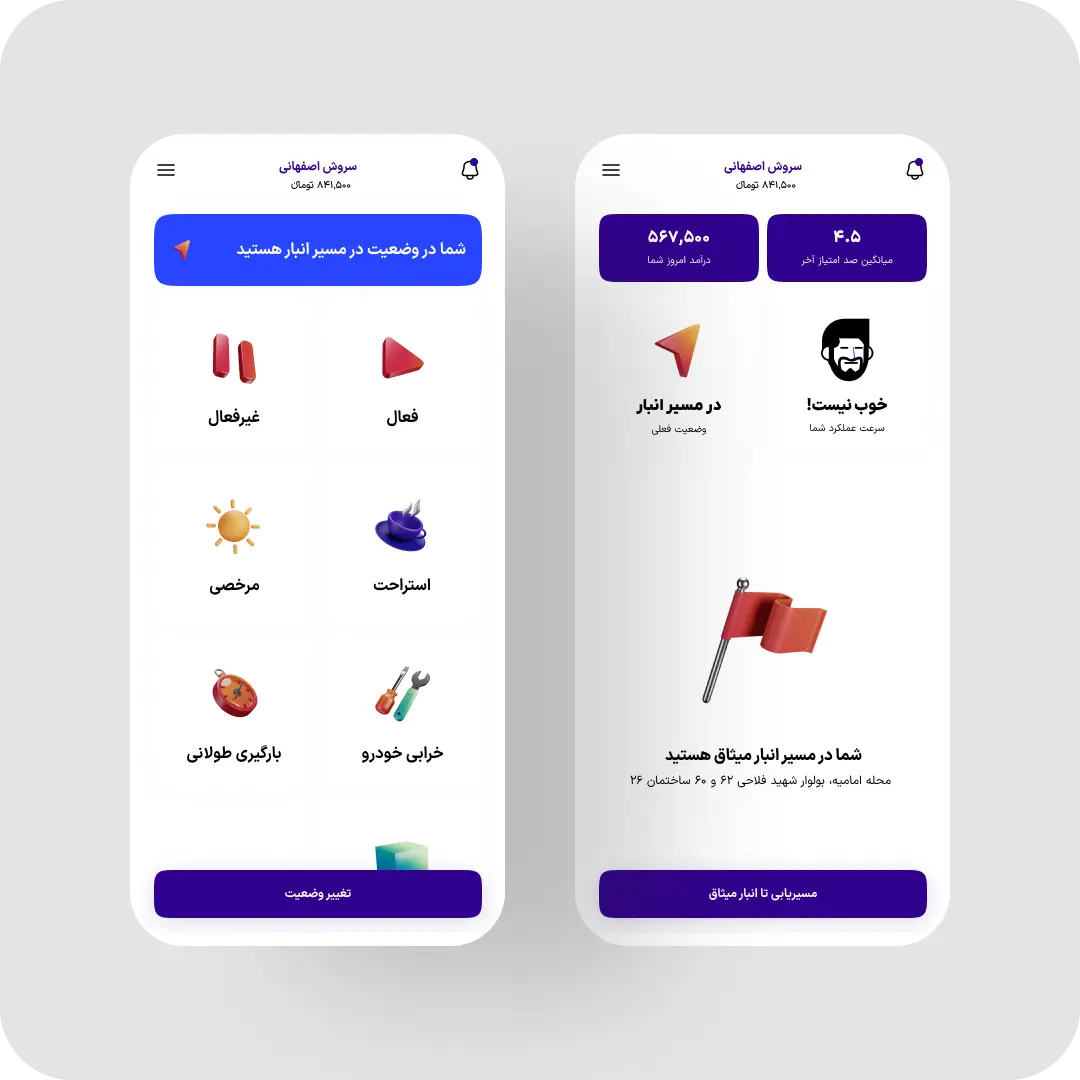
- Redesigned driver status-switching to be one tap, fixing a blind spot that hid who was actually working.
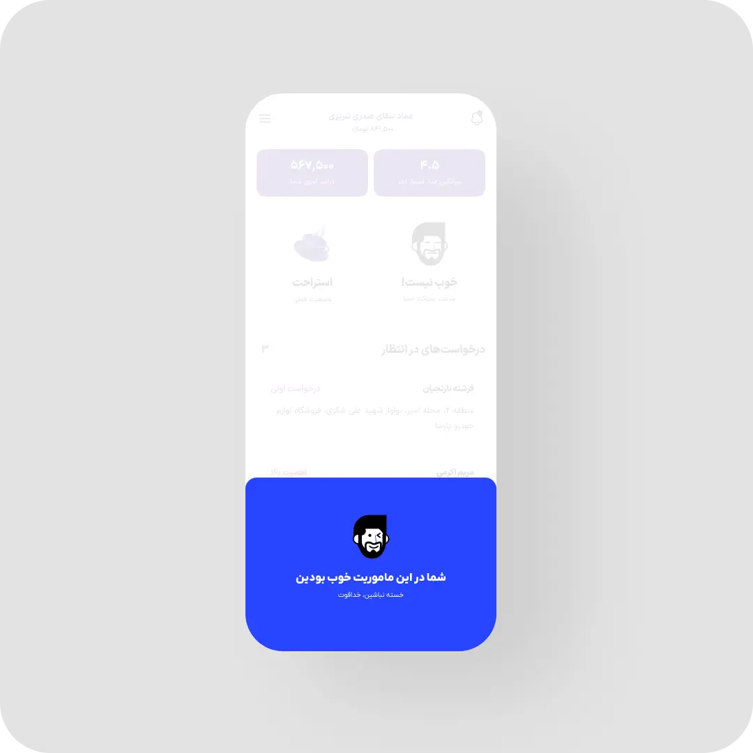
- Rebuilt the UI for outdoor legibility — bold type, high contrast, oversized targets for quick roadside checks.
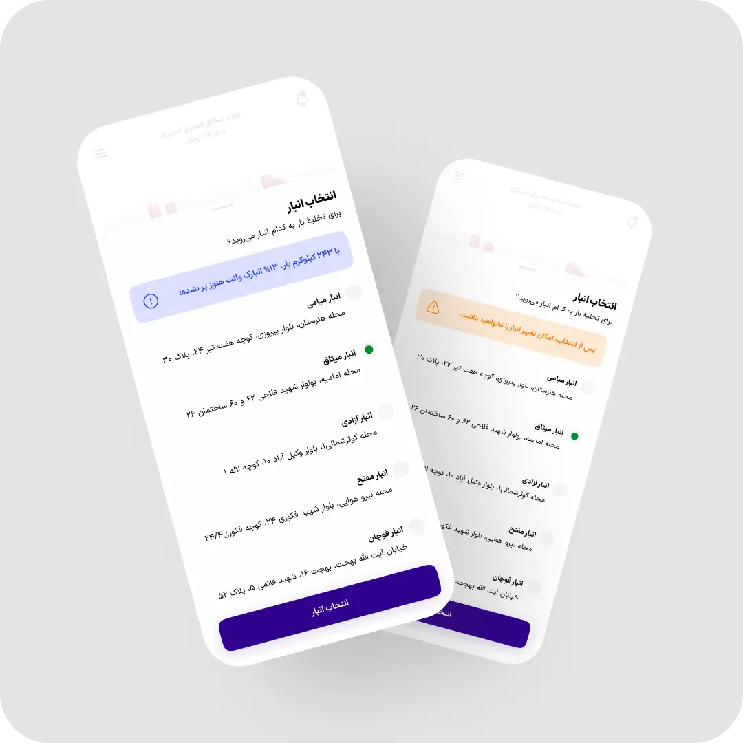
- Added real-time warehouse capacity data so drivers stop driving to closed or full depots.
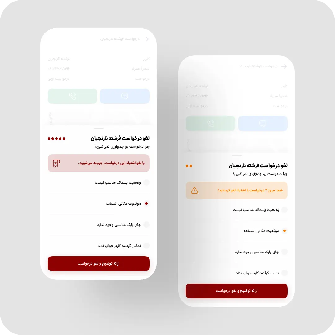
- Capped daily cancellations, required a reason, and tied repeat cancellations to a pay deduction.
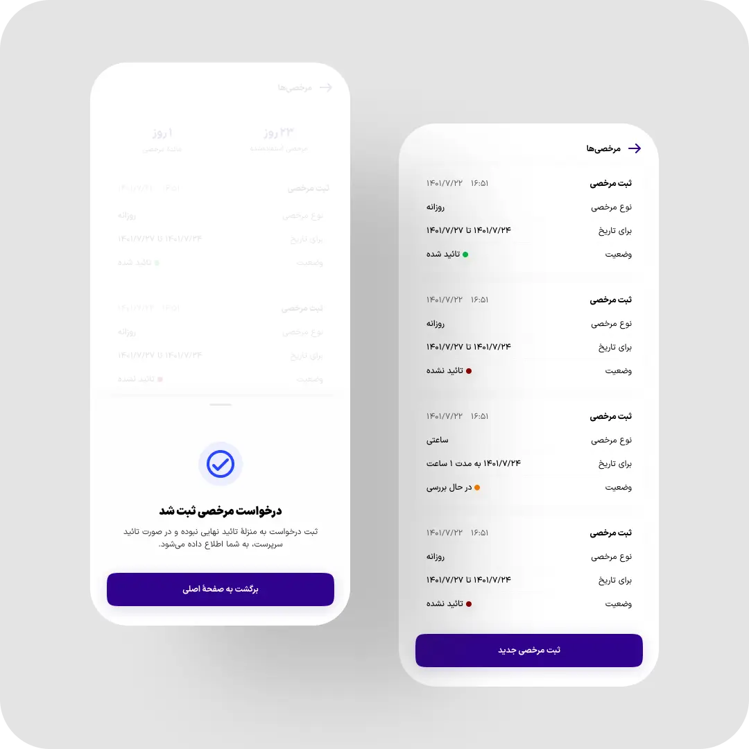
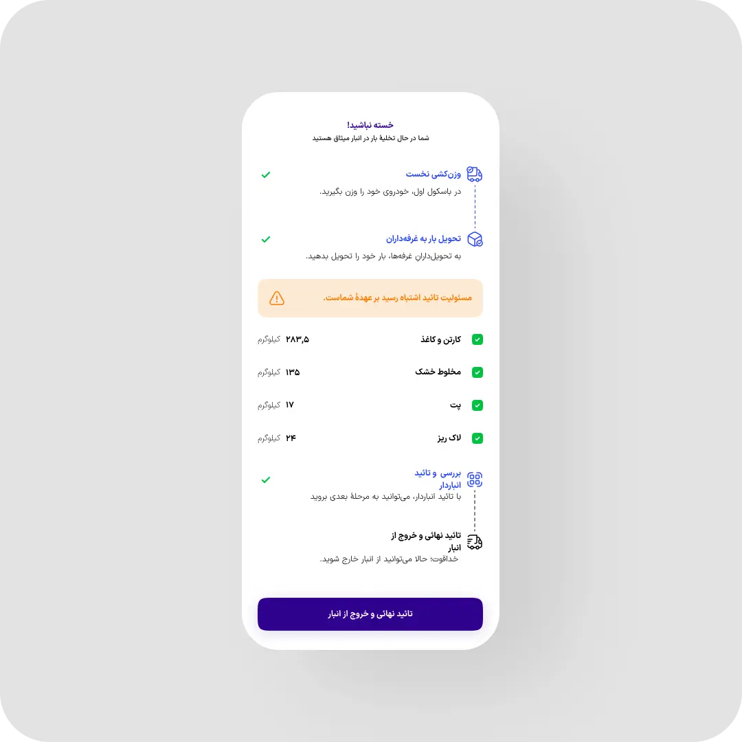
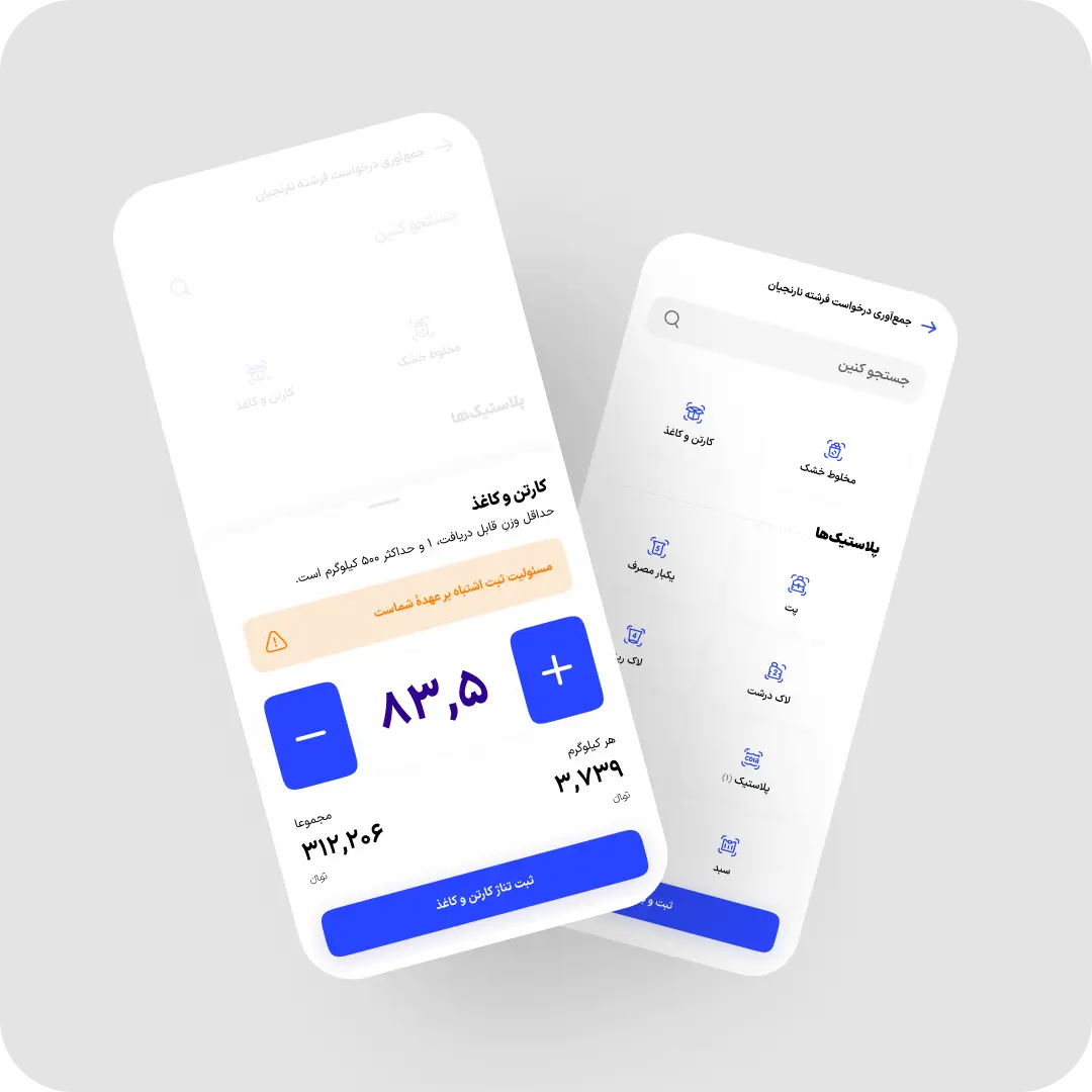
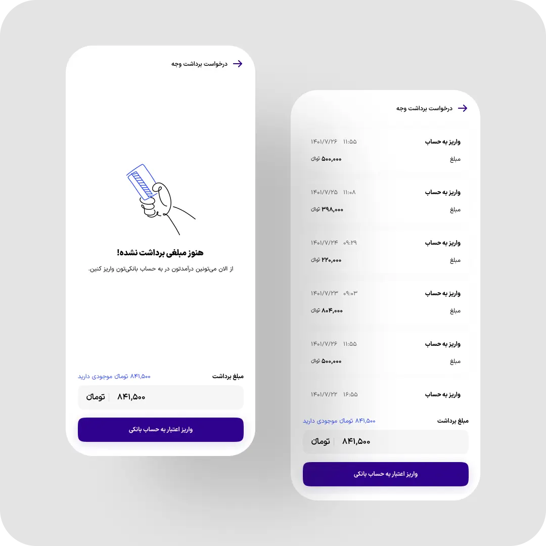
- Redesigned weight logging with oversized controls and a numeric keypad, and brought leave requests and cashouts natively into the app.
What changed
- +40% driver retention
- -20% average route time, -15% fuel cost
- +67% more accurate status logging, 1.98x engagement
- -35% driver-cancelled requests
- +18% faster weight logging, 31% faster cashouts
Why it matters
Every metric here maps to operating cost or retention, not just a smoother screen. Faster routes and fewer wrong-warehouse trips cut fuel spend directly. Fewer disputed cancellations mean more of the requests coming from Eco’s 350,000+ users actually get collected — and with only around 200 drivers covering 6 cities, keeping each one on the road matters even more than in a larger fleet.
Measured Impact
Impact by the Numbers
Grouped by what each metric protects
Figures are rounded and approximate — not a formal controlled study. Validated through Yandex AppMetrica, Microsoft Clarity, and direct interviews with drivers.
End of TL;DR⊛
End of TL;DR⊛
End of TL;DR⊛
End of TL;DR⊛
End of TL;DR⊛
End of TL;DR⊛
End of TL;DR⊛
End of TL;DR⊛
↓ Full Case Study ↓
The summary is above. Everything below is how it actually happened — the decisions, what failed first, and what I’d trade differently next time.
What Was Broken?
01
Invisible Fleets, Blind Decisions
Drivers had to dig through menus to change status, so most gave up. Fleet managers couldn’t tell who was working, resting, or gone — and user requests went uncollected with no visibility into why.
02
Unreadable in Daylight
Drivers often checked the app during brief roadside stops, in direct sunlight, and under time pressure. Small fonts and low contrast made anything but a quick glance difficult to scan.
03
Blind Warehouse Trips
Drivers had no way to know if a warehouse was closed or full before driving there with a loaded truck — wasting time and fuel on trips that ended in turning around empty-handed.
04
Unlimited, Reason-Free Cancellations
Drivers could cancel any pickup for any reason, or none. Left unchecked, this eroded user trust in whether a request would actually be collected.
The Goal
A Tool That Moves at the Speed of the Route
Drivers needed an app that worked reliably outdoors, in direct sunlight, and under real time pressure — checked during brief stops, not while driving — and gave fleet managers an honest picture of who was actually working. Every redesign decision traded some visual polish for speed and legibility in the field.
Driver-First
Fleet Visibility
Built For The Road𖦹
Built For The Road𖦹
Built For The Road𖦹
Built For The Road𖦹
The Core Collection Flow
Every pickup a driver completes moves through the same four moments — this is where most of the decisions below actually live.
Step 1
Request Assigned
AI matches an incoming pickup to a driver by proximity, truck capacity, and current status — the piece drivers now keep accurate.
Step 2
Driver Confirms & Navigates
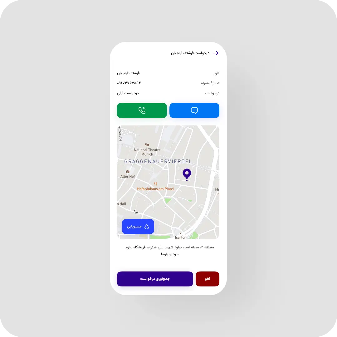
Driver reviews location, ETA, and user notes, then heads to the pickup with a high-contrast, glanceable route view.
Step 3
Waste Weighed & Logged
Weight and material type are logged on-site with oversized controls — this entry directly triggers the user’s cash reward.
Step 4
Load Dropped
Once the truck’s bed is full, the driver checks live warehouse capacity and routes to one that can actually accept the load.
Research Instrument
The Field Research Behind Every Decision
Three inputs, cross-checked against each other before anything shipped.
0
One-on-One Driver Interviews
Direct conversations with drivers, not filtered through a manager.
0
Structured Survey Respondents
Used to check whether interview findings held at scale.
City Coverage
3 cities evaluated directly; the deepest, most sustained fieldwork stayed concentrated in one.
All figures reflect field research conducted directly for this project — interviews and survey responses collected first-hand, not third-party panel data.
Research
Designing for a Driver, Not a User Persona
Method
I conducted 15 one-on-one driver interviews and ran a structured survey that reached 48 additional drivers, to check whether interview findings held at scale. Field evaluation covered three cities directly, with the deepest, most sustained fieldwork concentrated in one city as the primary base.
Finding
Many drivers had limited familiarity with complex mobile interaction patterns, and a large share were older workers who valued continuity over novelty — a different profile than a typical consumer app audience.
What I Did With It
I kept parts of the legacy interaction patterns intact rather than freely redesigning everything — trading some ideal-state design decisions for real day-one adoption.
Research → Decision
From the Field to the Call I Made
Every major decision traces back to a specific finding. Tap a decision to see it.
15
Driver Interviews
48
Survey Respondents
3
Cities Evaluated
Cross-
Validated
Validated
"
Findings synthesized from interviews, survey responses, and direct field evaluation — cross-checked against each other before shaping a decision.
The Calls I Made
Three Key Decisions
Not every decision in this redesign had a clean, cost-free answer. These three traded something away on purpose. I tackled them in this order — status first, then warehouse routing, then cancellations — because each one unblocked data the next decision depended on: accurate status made routing worth building, and reliable routing made the cancellation data trustworthy enough to act on.
01
Redesign Status Selection, Don’t Automate It Away
AI already matched requests to drivers by proximity and capacity. But the system still needed drivers to self-report availability — resting, off-shift, broken down. I chose to invest in making that manual input effortless rather than trying to infer it automatically.
● Redesigned, Not Removed
02
Check the Warehouse Before the Driver Commits
Rather than let drivers discover a closed or full warehouse on arrival, I surfaced live capacity data before they chose a drop-off point. This shifted the decision earlier, to the moment when changing course was still cheap, instead of after a wasted trip with a full truck.
● Shipped Pre-Trip
03
Cap Cancellations Instead of Banning Them
Drivers needed room for legitimate one-off issues — an unreachable user, a genuinely absent pile of waste. I set a daily cap of 3–5 cancellations tied to an existing company-wide deduction framework, with Fleet Ops reviewing disputed cases before any deduction stood.
● Capped, Not Banned
Decisions, Failures, and Surprises
How It Played Out
Here’s what I tried, what failed first, and what surprised me on the three decisions above.
Closing the Status Blind Spot
Drivers work a fixed 9am–9pm shift but aren’t available the whole time — resting, off-shift, or dealing with a broken-down truck. Before the redesign, changing status took enough digging that most drivers just didn’t bother.
Hypothesis
If status-switching took one tap instead of a menu hunt, drivers would keep it accurate — giving fleet managers real visibility for the first time.
What I Built
A persistent, always-visible status control with large tap targets and clear icons for each state, surfaced right on the main dashboard instead of buried in a settings menu.
Surprise
The visual redesign alone wasn’t enough — drivers only committed to using it once the control felt fast enough to complete during a short stop without slowing the route. Speed of interaction mattered more than the icon set.
Result
Accurate status logging — the share of active shifts where a driver’s app status matched Fleet Ops’ manual verification — rose by 67%, giving fleet managers a fleet view that finally matched reality.
Routing Drivers to Warehouses That Are Actually Open
After filling a truck, drivers had to choose a warehouse to unload at — with no visibility into whether it was open or had capacity. Wrong guesses meant a wasted round trip with a full load.
Hypothesis
Surfacing live warehouse capacity before the drop-off decision, not after arrival, would eliminate most wasted trips.
What I Built
A drop-off selection screen showing real-time open/closed and capacity status per warehouse, so drivers pick a destination they know can actually accept the load.
Surprise
The benefit wasn’t just fewer wasted trips — warehouse staff also started expecting specific drivers, since arrivals were now predictable instead of walk-in.
Result
Successful drop-off speed — the median time from choosing a warehouse to a confirmed unload — rose 45%, and visits ending at a warehouse that was closed, inactive, or unable to accept the load dropped 70%.
Capping Cancellations Without Alienating Drivers
Some drivers were cancelling pickups over personal friction with a user, distance, or simply not wanting the job — unlimited and reason-free. Left alone, this eroded user trust in the whole service.
Hypothesis
A visible daily limit, a required reason, and a real financial consequence would cut abusive cancellations without punishing drivers who had one legitimate bad day.
What I Built
A cancellation flow requiring a written reason, a visible counter showing cancellations used that day, and a 3–5 daily cap tied to a pay deduction beyond it.
What I Rejected
I rejected an outright ban on cancellations — drivers legitimately hit unreachable users and no-show pickups, and a zero-tolerance policy would have punished honest behavior.
Result
Most drivers reduced their cancellations before ever reaching the cap, suggesting the visible counter itself — not just the penalty — shaped behavior. Overall driver-cancelled requests dropped 35%.
Also Shipped
Supporting Improvements
Three smaller changes that mattered less individually than the three decisions above, but added up.
Weight Logging
Oversized +/- controls and a direct numeric keypad cut logging time by 18%, feeding into a 3% lift in overall collection speed.
Cashout
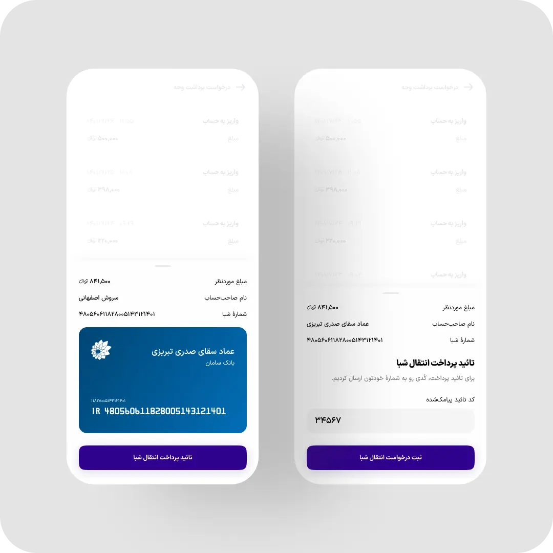
Cashouts moved natively into the app with bank-detail confirmation and SMS verification, cutting withdrawal time by 31%.
Leave Requests
Leave requests, balances, and approval status moved out of a separate web flow drivers previously had to leave the app to use, and into a single in-app view.
The Trade-Offs
What I Traded Off
- Driver autonomy vs. user trust: capping cancellations and attaching a pay penalty protects users from unreliable pickups, but a driver having a genuinely bad day gets less benefit of the doubt than before.
- Visual restraint vs. outdoor legibility: the bold, high-contrast interface reads as less polished in a portfolio or stakeholder deck than a more minimal alternative — but it’s the version that actually works in direct sunlight.
- Ideal-state design vs. adoption: drivers’ limited familiarity with complex patterns meant keeping parts of the legacy UI instead of rebuilding it cleanly — a deliberately imperfect compromise for actual day-one usage.
Reported By Drivers
85% of survey respondents reported being satisfied or very satisfied with the redesigned financial and scheduling tools.
Measured Impact
Results
Some figures are approximate, based on internal reporting rather than a formal controlled study. Retention in particular reflects several factors beyond the redesign alone.
These numbers come from Eco’s own product analytics (Yandex AppMetrica, Microsoft Clarity) and driver satisfaction surveys following rollout.
Primary Outcome
40
%
Increase in Driver Retention
A persistent one-tap status control made it easier for drivers to keep their availability up to date — giving Fleet Ops a more reliable view of who was working, resting, off-shift, or unavailable.
Fleet Visibility
OPERATIONAL OUTCOME
70
%
Fewer Wrong Warehouse Visits
Live warehouse capacity helped drivers avoid closed, inactive, or full drop-off locations before committing to the route — reducing wasted trips, fuel consumption, and unload delays.
Operational Efficiency
Route Efficiency
20
%
Faster Average Routes
AI-assisted assignment plus accurate driver status cut average route time.
Fuel Cost
15
%
Lower Fuel Spend
Fewer wasted miles from bad assignments and blind warehouse trips.
Trust & Reliability
35
%
Fewer Driver Cancellations
Capped, reason-required cancellations reduced unreliable pickups for users.
Daily Volume
25
%
More Pickups Completed Daily
Faster routing and logging let drivers complete more requests per shift.
Satisfaction
85
%
Driver Satisfaction Rate
Surveyed drivers rated the new financial and scheduling tools highly.

Leadership Feedback
“Soroush is the perfect blend of thoughtfulness, intelligence, and innovation — not just a problem solver, but a visionary who consistently surprises us with creative solutions. What sets him apart is his impeccable communication and teamwork; he makes collaboration effortless and enjoyable. He’s a joy to work with and a true asset to our team.”
Amin Khosravi | Co-founder & CTO @EcoIWM
Retrospective
What I'd Do Differently
The Constraint I Learned Late
Research for this project came directly from the field — 15 one-on-one driver interviews, a survey that reached 48 more drivers, and direct evaluation across three cities. That fieldwork is where I learned, later than I’d have liked, that many drivers had limited familiarity with complex interaction patterns — which meant preserving parts of the legacy UI instead of redesigning everything cleanly.
What I’d Change Today
Two things. First, the request-assignment flow — there’s still more room to improve how requests get matched and handed to drivers. Second, the cancellation dispute process — Fleet Ops did review flagged cases before any deduction stood, but that review happened entirely off-app. I’d build dispute status directly into the driver’s view instead of leaving it as a manual, invisible step.
A Caveat on the Numbers
Retention and engagement track closely with the redesign, but they moved alongside operational and recruitment changes happening at the same time. I can’t isolate design as the sole cause — only as one clear, measurable contributor among several.
Beyond the Screen✦
Beyond the Screen✦
Beyond the Screen✦
Beyond the Screen✦
Beyond the Screen✦
Outside the Product Roadmap
Collaboration & Scope Beyond UI
I worked as the translation layer between drivers, Fleet Ops, and engineering — turning field observations into product requirements and operational constraints into interaction rules. Fleet Ops initially wanted status inferred automatically from GPS and shift data; I pushed back with the field research showing self-reported status was the more honest signal, and we shipped the manual-but-effortless version instead. Each major workflow was reviewed with engineering before development to surface edge cases early.
Not Just Pixels
The Collaboration Map
This project only worked because of who I worked with. Tap a team to see where they came in.
Soroush
Product Design
"
Brand & Identity
Visual Identity for Both Apps (Citizen and Driver)
I designed the visual identity system for the citizen and driver apps — a brand document defining visual elements, tone of voice, and usage guidelines specifically for how Eco communicated with drivers.
Growth & Marketing
Recruiting Drivers From Competitors
I partnered with the marketing team to promote Eco Driver’s redesigned features directly to drivers working for competing services — turning product improvements into a recruiting pitch.
Ops & Structure
The Org Chart Behind the Fleet
I designed the organizational structure and reporting chart for how driver operations were managed across every city Eco covered — not just the app, but the team behind it. It was adopted across the fleet and other departments without me holding any direct management authority over them; teams saw it, found it useful, and started using it on their own.

